Gothic display font for high-impact titles
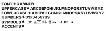
Damned Deluxe, created by Damned Deluxe, is a decorative display font intended to give headlines a gothic, horror-themed look for posters, album art, and branding. The font supplies bold letterforms with weathered, jagged edges in a standard TrueType (TTF) package, making it usable in desktop design and word-processing apps. It is licensed for commercial use and aimed at graphic designers and content creators who need a distinctive display face for title work.
What does Damned Deluxe do?
Damned Deluxe applies a gothic, distressed aesthetic to headlines and branding, using weathered, jagged edges and bold letterforms that prioritise visual impact over body-text readability. Typical applications include:
- posters and gig flyers
- album covers and themed packaging
- title screens and promotional banners
The design suits short phrases and single-word treatments where decorative character matters more than long-form legibility.
How much control does the font give designers?
The font is distributed as a standard TrueType Font (TTF), so designers adjust size, tracking, and styling through their layout software rather than via built-in variable weights. The typeface uses a consistent gothic treatment across case slots, meaning uppercase and lowercase follow the same decorative approach; pairing with a neutral companion face is a common way to balance layouts.
Is Damned Deluxe easy to install and compatible?
Installation follows a standard desktop workflow: download the ZIP, extract the .ttf file, right-click and choose Install, after which the face appears in design applications. The TTF format ensures compatibility with Windows, macOS, and Linux systems that support TrueType. No additional runtime or plug-in is required for basic desktop use, so the font integrates into typical design pipelines without extra setup.
Practical resource for licensed, thematic headline work
The font's permissive commercial license and wide distribution, with repository download counts reported above 100,000, make it a practical resource for designers producing horror-themed headlines. Designers who need multi-weight families or subtle text faces should look elsewhere. Practical tip: embed or convert text to outlines when exporting assets to preserve the decorative shapes across different systems and keep layouts consistent in client handoffs.